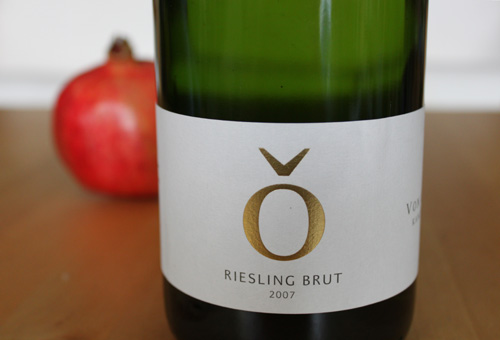
Von Othegraven, Riesling Sekt brut, 2007
Things have changed since we last reported on this old and well-respected Saar winery. Having run into some dire straits commercially - though not quality-wise, it needs to be pointed out - the estate was hurriedly taken over by one Günther Jauch, who was already in line for the eventual succession in ownership. This was a big piece of news far beyond the wine community in Germany, because Günther Jauch just happens to be a celebrity television host. A corporate makeover duly followed, streamlining label design and setting up what is probably the slickest website in the german wine business.

The jury is still out on wether the new labels are some snotty-nosed consultant's flinty-hearted destruction of heritage and historical continuity or a badly needed dusting-off. Although I am a great friend of the old-fashioned mosel labels, I nonetheless think the Othegraven design is a success, bringing a stylish streak of modernism in that traditionalist region. If nothing else, it has inspired the Wine Rambler's munich branch to some of its most ambitiously arty photography and food styling so far.

But we're getting distracted here - let's talk sparkling Riesling for a minute: The first thing we noticed was the fineness of the bubbles that rose in thin pearly strings, to be followed by a smell of pears, stone, and lemon peel. With good acidity, a mildly creamy body that integrates it, and faintly enticing caramel flavours in the background, the palate didn't let us down either. A very elegant and harmonious sparkling. If you don't mind giving an extra few euros to a fairly rich man, we can recommend trying it.

Comments
labels
Having now had a look at older von Othegraven labels, I can see why traditionalists are unhappy with the new one. The old ones were not overly stuffy but sent a clear 'I am a German wine with history and tradition' message. So from that point of view updating the label was perhaps not necessary. Having said that I do think the new design works and, at least for this sparkler, it almost seemed to be more true to the simple elegance of the wine than the old one. To sum up: I like it.
In reply to labels by torsten
Othegraven label old vs. new
Direct comparison...
... shows (my opinion) advantages of the clear and modern design, and the colour is great!